Skip to main contentCharts allow you to visualize your data, making it easy to identify key insights with a variety of available chart types.
Create a Chart
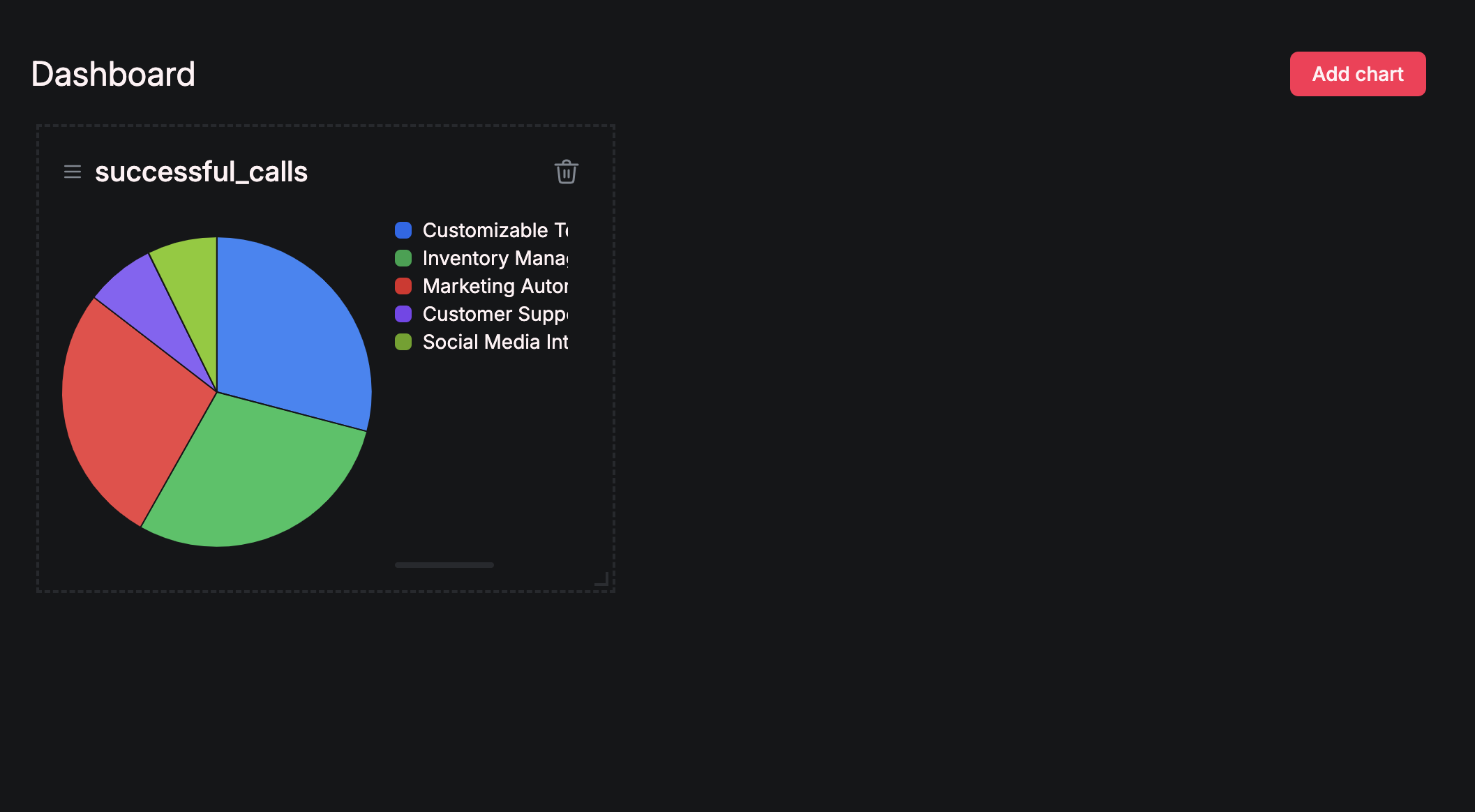
Navigate to “Dashboard” in the left menu bar, then click on “Add Chart”:
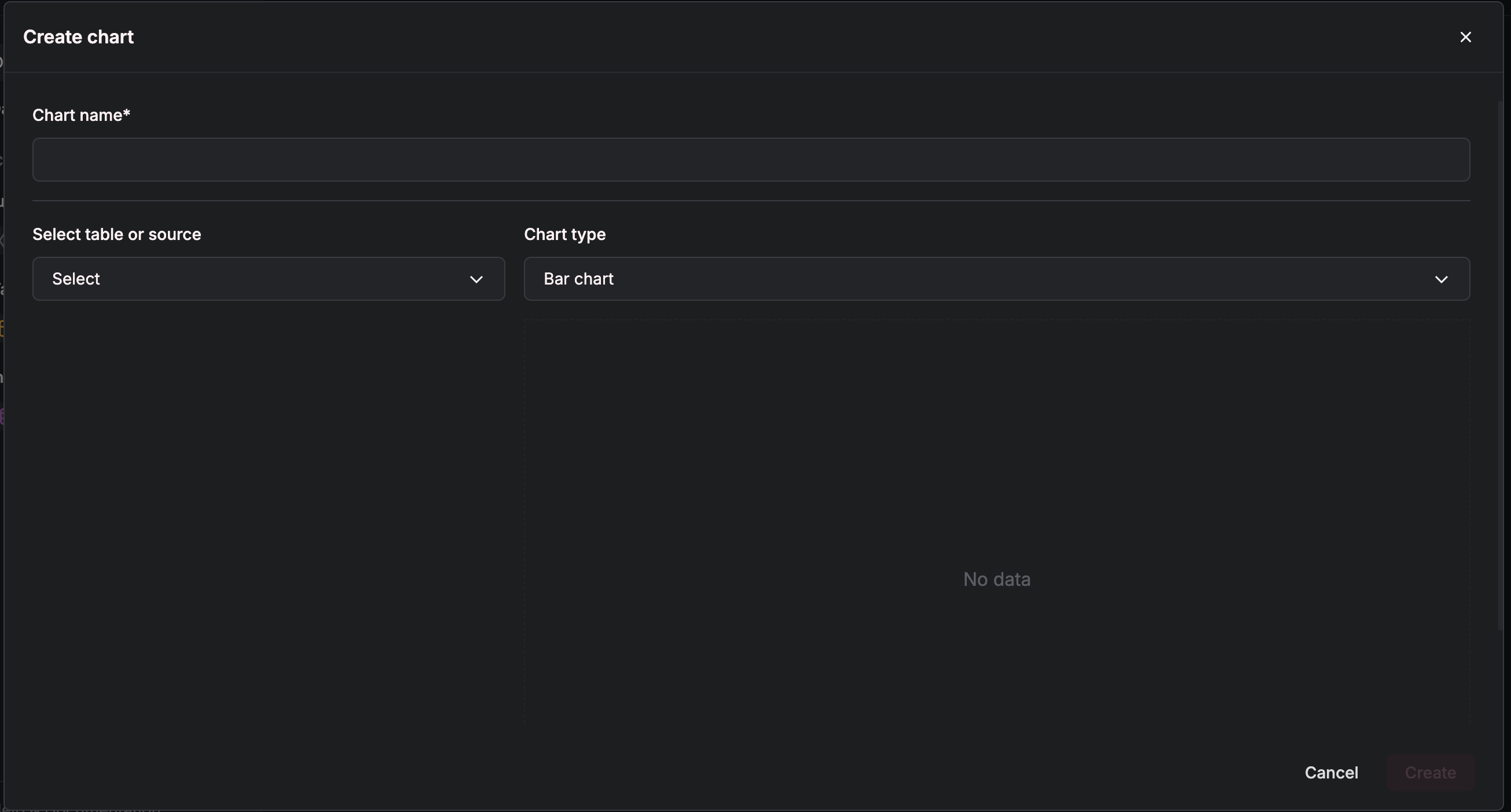 First, select the table or source you wish to create this visualization from.
Let’s continue our example with sales calls:
First, select the table or source you wish to create this visualization from.
Let’s continue our example with sales calls:
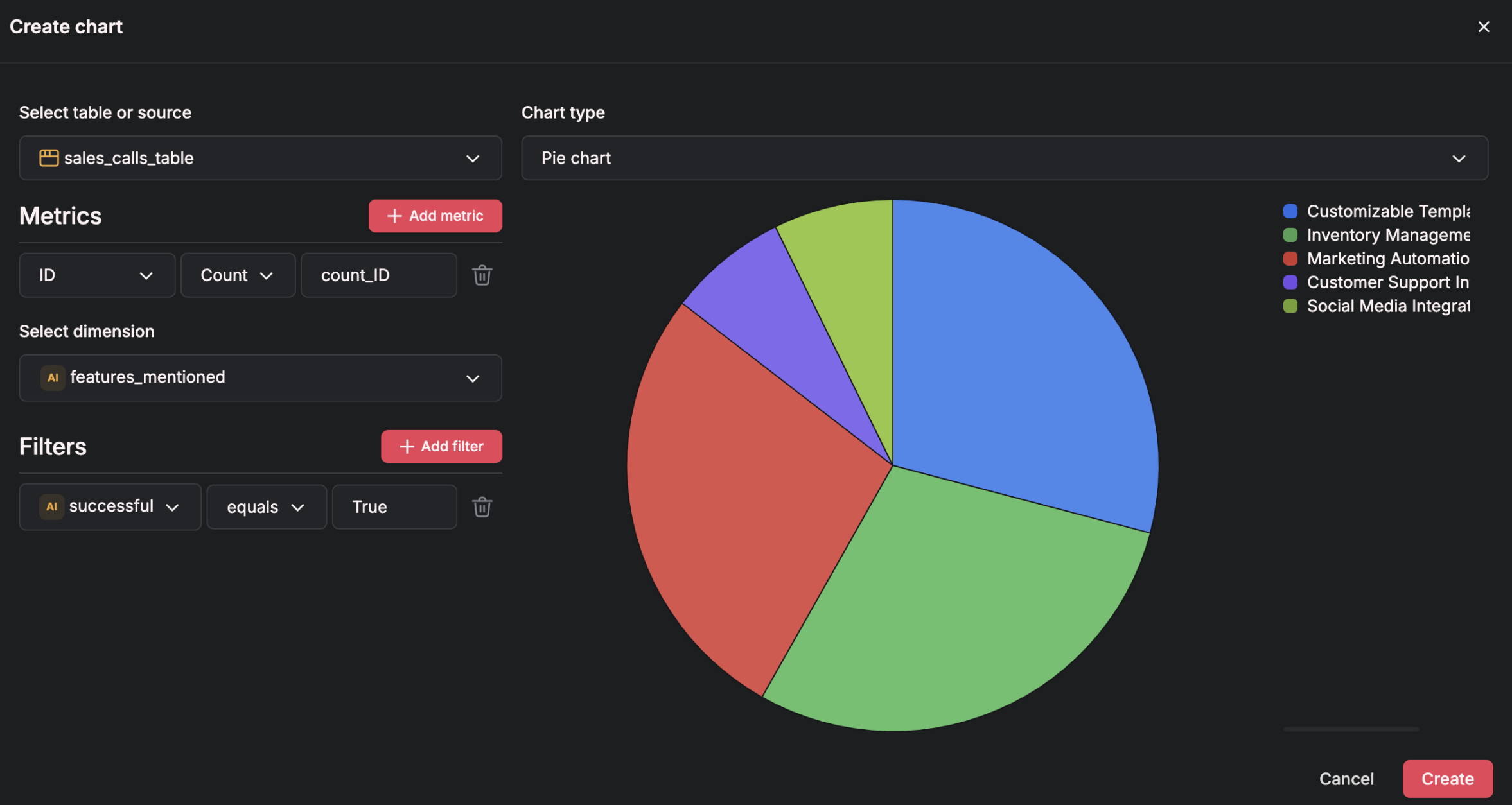
- Metrics represent what you are measuring, like the count or sum of an attribute—in a bar chart, this would typically be shown on the y-axis
- Dimensions define the categories or grouping of data—in a bar chart, this corresponds to the x-axis
- Filters allow you to narrow down data by specifying conditions, showing only the data that meets those criteria
Here, we’re visualizing the distribution of features mentioned specifically in successful calls.
Finish by clicking “Create”: